In recent years, there has been a notable shift in home decor trends, with pastel shades emerging as a prominent choice for homeowners and designers alike. This resurgence is not just a fleeting fad; rather, it reflects deeper psychological and aesthetic preferences that are resonating with today’s modern sensibilities. Whether you are looking to refresh a single room or embark on a complete renovation, understanding the pervasive influence of pastel colors can greatly enhance your design decisions and overall satisfaction with your living space.
Understanding Pastel Colors and Their Significance
Pastel colors, characterized by their soft and muted hues, evoke feelings of calmness and tranquility. These shades, which include soft pinks, blues, greens, and yellows, are often associated with springtime and renewal, imbuing spaces with a sense of lightness and airiness. According to color psychology, pastel tones can significantly influence mood and behavior. They tend to have a soothing effect, making them ideal for spaces meant for relaxation, such as bedrooms and living areas.
Moreover, the versatility of pastel shades is remarkable. These nuancess seamlessly blend with various design aesthetics, from contemporary clean lines to bohemian eclecticism. This adaptability demonstrates why more homeowners are incorporating pastel hues into their decor schemes.
Key Trends in Using Pastel Shades
The contemporary design landscape is witnessing the integration of pastel colors through various mediums and elements of home decor. Designers are utilizing these gentle tones in a multitude of ways, ranging from wall paint selections to furniture choices, textiles, and decorative accessories.
1. Painted Walls and Ceilings
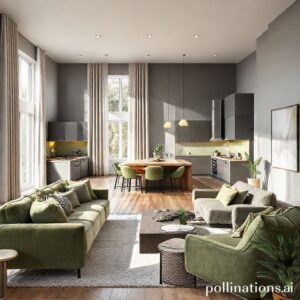
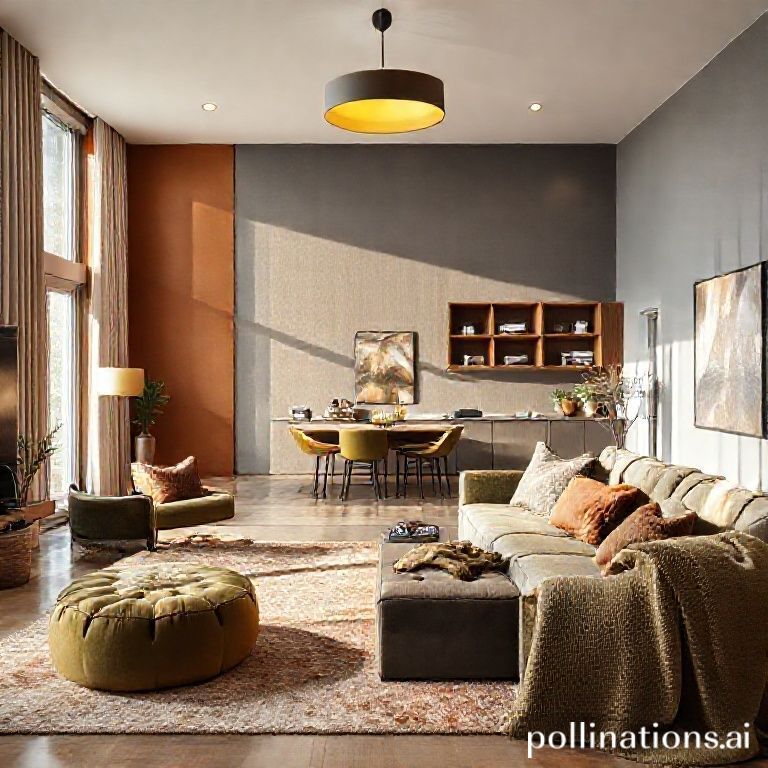
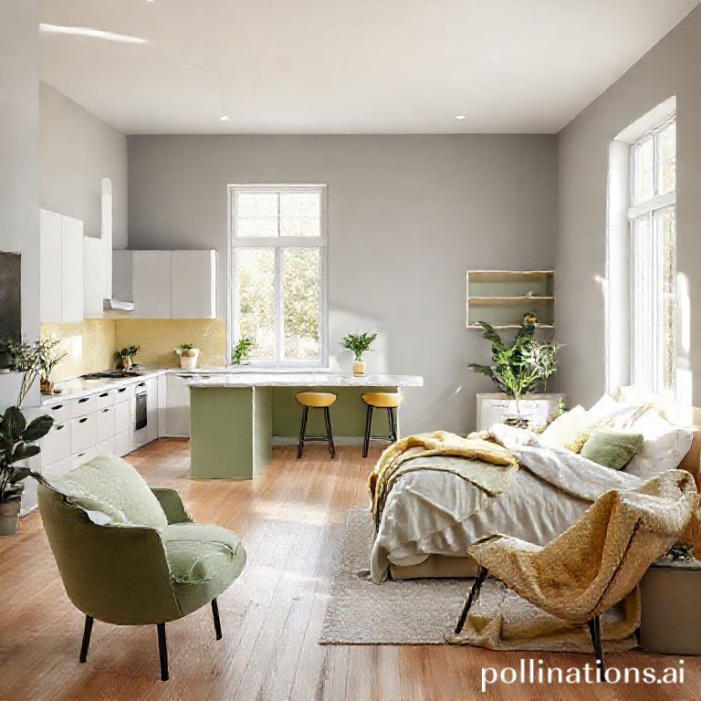
A significant trend is the use of pastel paints on walls and ceilings, offering a fresh alternative to traditional neutral palettes. Soft shades of mint green, blush pink, and baby blue serve as perfect backgrounds that create a tranquil environment. Designers suggest using pastels in open-concept spaces to promote a sense of continuity and flow across the home. For example, a light mint accent wall can create an inviting atmosphere in the living room while harmonizing beautifully with adjoining pastel-colored kitchen walls.
2. Bold Furniture Statements
Pastel colors are also making waves in furniture design. Many homeowners are opting for pastel upholstered sofas and armchairs that not only serve as eye-catching focal points but also reinforce the calming nature of these hues. Consider a light lavender sectional paired with neutral accent pillows to achieve an effortlessly chic ambiance. When selecting furniture pieces, be mindful of balance and proportion to prevent the space from feeling overly saturated with color.
3. Art and Decorative Accessories
Incorporating art pieces and decorative accessories in pastel shades can enhance the aesthetic appeal of any room. From abstract paintings with a harmonious blend of soft colors to pastel-hued vases and throw pillows, these elements provide excellent opportunities for expression without overwhelming the space. Layering different pastel colors across various accessories allows you to create a cohesive look that feels both chic and inviting.
4. Textiles and Fabrics
One of the easiest ways to introduce pastels into your home is through textiles. Curtains, rugs, and throw blankets in delicate pastel shades add warmth and texture to a room. Opting for fabrics like linen and cotton can enhance the airy feel that pastels provide. When chosen thoughtfully, pastel textiles can create an inviting atmosphere, encouraging relaxation and comfort.
Designer Insights: The Impact of Pastels on Home Design
According to leading design experts, pastel colors do more than just beautify a space; they play a pivotal role in shaping the atmosphere of a home. During interviews, several interior designers emphasized the importance of color in establishing a mood and how pastels can mitigate the harshness often inherent in bolder colors. “Using softer shades invites a more peaceful vibe, allowing homeowners to feel more at ease in their own spaces,” noted one prominent designer.
Furthermore, pastels allow for seasonal versatility. As trends evolve, so too can your decor by simply switching out a few accessories or textiles, proving that embracing pastel shades is a sound and stylish investment.
Common Mistakes to Avoid When Using Pastels
While incorporating pastel colors can greatly enhance your home’s style, homeowners should be cautious of common pitfalls. Here are some to avoid:
- Over-saturation: Using multiple pastel colors without a unifying theme can create a chaotic feel. It’s crucial to maintain balance by sticking to two or three color families and allowing them to coexist harmoniously.
- Neglecting Lighting: Pastels can look different under varying lighting conditions. It’s essential to test paint samples in different parts of the room at various times of day to see how they interact with light.
- Forgetting Contrast: Pairing pastels with similarly toned shades may lead to a washed-out appearance. Incorporate contrasting accents, such as dark wood furniture or metallic finishes, to balance the softness of pastels and add depth to the design.
Pro Tips for Incorporating Pastels into Your Home
To successfully integrate pastel colors into your home decor, consider the following pro tips:
- Start Small: If you’re unsure about fully committing to pastels, begin with small elements, such as throw pillows or art prints, before expanding to larger pieces.
- Layer Textures: To bring richness to pastel schemes, layer different textures—mix embroidered fabrics with smooth finishes for a tactile experience.
- Balance with Neutrals: Use neutrals to ground the color palette. Incorporate shades of white, beige, or gray to ensure pastels remain the highlight of your decor without competing for attention.
Conclusion: Embrace the Pastel Revival
The resurgence of pastel shades in home decor signifies a cultural shift towards softer, more serene living spaces. As we navigate the complexities of modern life, creating a sanctuary infused with light colors can foster tranquility and comfort. Consider how pastel tones can harmoniously fit into your existing decor or inspire fresh designs. By thoughtfully integrating these gentle hues, you can transform your home into a haven that reflects your unique style and nurtures your well-being.
For further insights on color trends and styling tips, be sure to explore our collection of articles tailored to elevate your home decor journey. Whether you’re drawn to contemporary minimalism or vibrant eclectic expressions, there’s something for everyone in the world of home design.