As we step into 2024, the impact of color psychology on home interior design continues to be a significant factor influencing the mood and atmosphere of living spaces. With a growing understanding of how colors can evoke emotions and set the tone of a home, it’s crucial for singles and students seeking to create a personalized and inviting environment to harness the power of trending colors. In this article, we will delve into the psychological implications of color choices and how they shape our daily experiences within our homes.
The Essence of Color Psychology
Color psychology is a field that explores how colors affect human behavior and emotions. Different hues can inspire a variety of psychological responses, influencing everything from our productivity levels to our relaxation and comfort. According to design experts, the psychological effects of color can essentially dictate the atmosphere of a space, making it vital to grasp these nuances when selecting colors for home interiors.
By recognizing the emotional connotations associated with certain colors, homeowners can curate environments that align with their lifestyle and emotional needs. Bold, neutral, and pastel shades all have distinct properties that can enhance the ambiance of contemporary and modern living spaces, making them ideal choices for the younger demographic.
Trending Colors in 2024
As we delve into the trending colors of 2024, certain shades stand out for their ability to transform spaces and influence moods. Expect to see a range of colors that balance vibrancy with tranquility, specifically designed to cater to the dynamic lifestyles of singles and students.
Bold Colors: Energizing Your Space
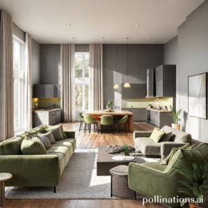
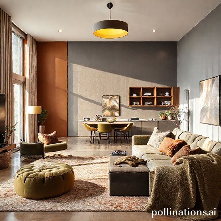
Bold colors like deep blues, fiery reds, and striking greens are gaining traction this year. These colors not only catch the eye but also energize and invigorate a space. For instance, a deep blue accent wall can create a sense of calm while simultaneously boosting creativity and focus—ideal for students studying or working from home. Such colors can also draw attention and make a powerful statement in social areas, encouraging lively interactions among guests.
Neutral Shades: Creating Balance and Calm
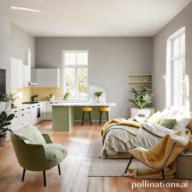
Neutral colors like soft beiges, warm greys, and creamy whites remain timeless, offering a versatile backdrop for any interior design. These hues are perfect for creating a serene environment conducive to relaxation and contemplation, which is particularly valuable for busy individuals seeking respite from the hustle of daily life. Adding textured elements like fabrics and accessories in varying neutrals can offer depth without overwhelming the senses.
Pastel Colors: A Gentle Touch of Softness
Pastel shades are making a comeback, bringing softness and a sense of tranquility to modern interiors. Soft pinks, mints, and lavenders can create an inviting atmosphere, perfect for intimate gatherings or quiet moments of reflection. These gentle hues are especially appealing to younger audiences, as they can evoke nostalgia while also embracing contemporary aesthetics. Designers suggest integrating pastels through paint, textiles, or decor to maintain a light and airy feel.
The Psychological Effects of Colors
Understanding the psychological effects of color is essential in harnessing their potential in interior design. Here, we discuss a few prominent colors and their respective emotional responses.
Blue: The Color of Calm
Blue is renowned for its calming effects, often associated with tranquility and stability. Incorporating blue hues into a space can help reduce stress and promote a sense of peace, making it an ideal color for bedrooms or study areas.
Red: A Catalyst for Energy
Contrastingly, red is an energizing color that stimulates excitement and passion. It’s a great option for social spaces like living rooms or dining areas where vibrant conversation is welcomed, but should be used sparingly to avoid overwhelming the senses.
Green: A Connection to Nature
Green shades bring a refreshing connection to nature, symbolizing growth and renewal. This color can increase comfort and improve air quality when used in home design, making it an excellent choice for indoor plants and green decor elements.
Yellow: Instilling Happiness
Yellow is often linked to happiness and prosperity. This cheerful hue can brighten up a space and enhance creativity; however, too much yellow may cause agitation. It is best used in accents or smaller doses to maintain a joyful atmosphere.
Designing with Color: Practical Tips
Utilizing color effectively in home design requires thoughtful planning and execution. Here are some practical tips to help you create a harmonious environment that aligns with color psychology principles.
1. Think About Functionality
Consider the functionality of each room when selecting colors. For instance, spaces dedicated to productivity, such as home offices, may benefit from energizing colors combined with neutral tones that promote focus. This approach encourages a balanced atmosphere conducive to both creativity and concentration.
2. Experiment with Accents
Incorporate bold or pastel colors through accent walls, furniture, or textiles rather than overwhelming the entire space with a single shade. Use color swatches to determine how different hues interact with natural light throughout the day, ensuring the desired atmosphere is achieved.
3. Embrace Texture and Patterns
Textures and patterns can elevate color choices, providing depth and richness to your design. Layering various materials, such as rugs, cushions, and artwork, can enhance the overall aesthetic and create a cohesive look that resonates with your style.
4. Lighting is Key
Lighting plays a crucial role in how colors are perceived in a space. Experiment with different light fixtures and bulbs to find the optimal temperature and brightness that showcases your chosen color palette effectively, ensuring the mood aligns with your intentions.
Common Mistakes to Avoid
While effectively using color in design can yield stunning results, it’s essential to avoid certain common pitfalls.
Overusing Bold Colors
Bold colors can invigorate a space, but excessive use can lead to feelings of restlessness or anxiety. It’s vital to balance vibrant shades with neutral or softer hues to maintain harmony.
Ignoring the Feel of a Room
Different rooms serve different purposes, and the color should reflect that function. Choosing colors without considering the emotional impact they may have can lead to a mismatch between purpose and atmosphere.
Neglecting Natural Light
Natural light dramatically affects color perception and should be taken into account when selecting shades. Consider the direction the room faces and how light interacts with your color choices throughout the day.
Conclusion
As we embrace the color trends of 2024, understanding the intricate relationship between color psychology and home interior design is more important than ever. By selecting colors wisely, singles and students can create spaces that not only reflect their personality but also enhance their overall mood and productivity. From energizing bold hues to calming neutrals and enchanting pastels, the colors you choose can profoundly impact your living environment. As a final tip, don’t hesitate to experiment—creating an atmosphere that resonates with you is an art form in itself. For more inspiration on creating vibrant yet functional spaces, consider exploring contemporary and modern designs that embrace sustainability while celebrating color.