Color is not just a visual phenomenon; it significantly influences our emotions, perceptions, and overall experience of spaces. When it comes to outdoor areas, the right color palette can transform a mundane yard into an inviting oasis or a dull facade into a striking architectural feature. In this comprehensive guide, we will explore the impact of color on outdoor spaces, with a particular focus on how to choose the perfect palette that complements your home’s architecture and landscape design. As we delve into this colorful journey, we’ll draw on contemporary, modern, and rustic styles to ensure that every homeowner, whether they are families or singles, can find inspiration tailored to their unique taste.
The Psychology of Color in External Design
Color psychology plays a pivotal role in how we interact with outdoor spaces. According to design experts, each color evokes specific feelings and responses. For instance, bold colors like red and orange can energize a space, making it feel vibrant and lively, while earth tones such as greens, browns, and beiges can create a sense of calm and grounding, perfect for outdoor retreats.
This powerful connection between color and emotion influences not only how we feel in a space but also how we perceive the surrounding environment. When selecting an outdoor color palette, consider how different shades will affect the aesthetic and emotional experience of your home. For instance, a modern home might benefit from a striking combination of deep blues and bright whites, emphasizing clean lines and an open feel, whereas a rustic property may look best with soft greens and warm browns, blending it harmoniously with nature.
Choosing the Right Palette: Factors to Consider
When curating your outdoor color palette, several critical factors must be considered to ensure that your choices enhance both your home’s exterior and its surrounding landscape. Below, we outline key considerations to guide you through this vibrant decision-making process.
1. Architecture Style
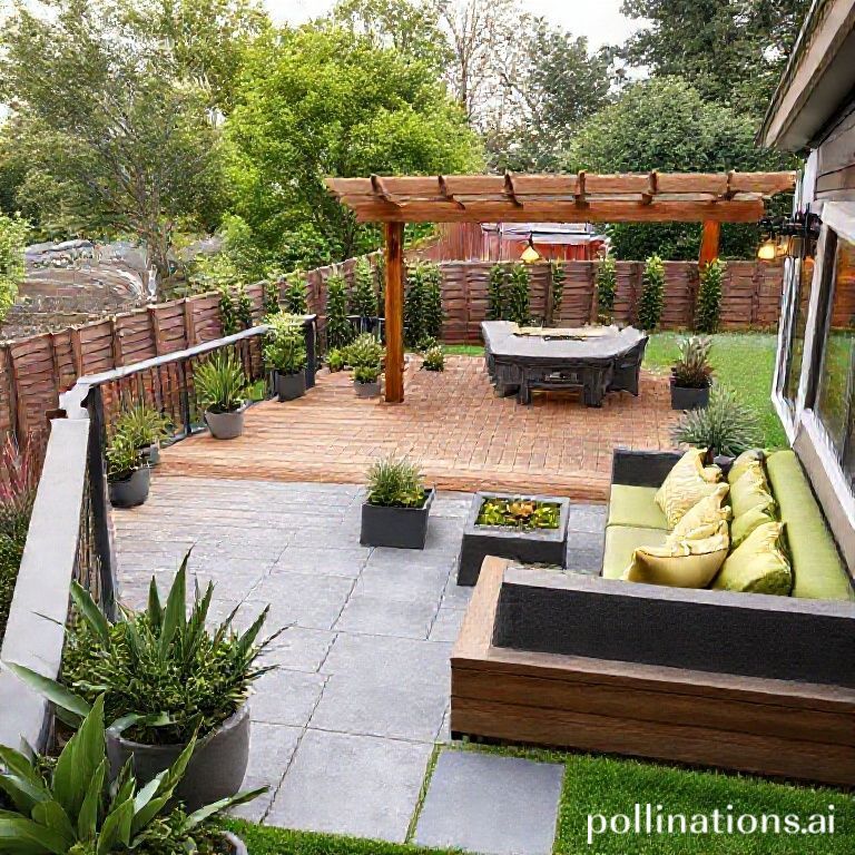
The architectural style of your home significantly impacts your color choices. For contemporary designs, clean lines and bold colors work exceptionally well. Consider using a bright accent color on your front door or window frames to create visual intrigue. In contrast, modern homes typically favor a more subdued color scheme, emphasizing neutrals and pastels that complement the materials used, such as stone or wood. Alternatively, rustic homes may benefit from earth-tone palettes composed of greens, browns, and other natural hues that resonate with the outdoor environment.
2. Landscape Integration
How your color choices interact with your landscaping is crucial. You want colors that create harmony with the natural surroundings. For homes surrounded by lush greenery, incorporating vibrant blooms or earthy tones can provide a pleasing contrast that enhances both the home and landscape. Pro Tip: When planning garden beds or outdoor seating areas, consider using color swatches to see how different shades interact with the plant life already present.
3. Seasonal Considerations
Different seasons can heavily influence outdoor aesthetics. It’s essential to pick colors that stand the test of seasonal changes. Spring and summer are ideal for experimenting with lighter, more vibrant shades that reflect the liveliness of blooming flowers. For example, pastels and bright shades can evoke a cheerful atmosphere, while rich, warm colors like deep reds and bright oranges can add warmth and comfort during the fall months. Therefore, striking a balance between seasonal adaptability and personal preference is crucial to maintaining a cohesive exterior throughout the year.
4. Sustainability and Materials
As homeowners become more conscious of sustainability, selecting colors and materials that reflect this ethos is increasingly important. Natural materials such as wood and stone not only provide a timeless appeal but can also influence your color choices. Earthy hues often work seamlessly with these materials, enhancing the overall aesthetic without overwhelming it. Furthermore, the durability of paint can vary; therefore, consider using high-quality, eco-friendly paints that can withstand the elements while minimizing environmental impact.
Color Combinations to Inspire Your Outdoor Spaces
Now that we have explored the critical elements of selecting a color palette, let us delve into some inspiring combinations that effectively express different styles while addressing practical considerations.
1. Bold Contrasts
- Color Pairing: Deep Navy and Bright Coral
- Style: Contemporary
- Application: Use navy as the base color for siding while incorporating coral as an accent on doors and outdoor furniture.
This striking contrast not only attracts attention but also creates a modern vibe that feels fresh and inviting.
2. Nature’s Palette
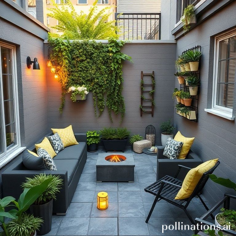
- Color Pairing: Warm Beige, Olive Green, and Soft Terracotta
- Style: Rustic
- Application: The use of olive green on fences combined with warm beige walls creates an inviting backdrop for vibrant terracotta pots.
This palette emphasizes organic materials and encourages a seamless connection between the home and the surrounding landscape.
3. Timeless Elegance
- Color Pairing: Soft Gray, White, and Dark Charcoal
- Style: Modern
- Application: Soft gray siding with dark charcoal trim provides a sophisticated yet understated appearance, particularly when complemented by white furnishings.
This elegant combination offers a chic, contemporary look that feels both classy and approachable.
Common Mistakes to Avoid When Selecting Colors
As you embark on your colorful journey, it’s important to steer clear of certain pitfalls that can detract from the beauty and cohesion of your outdoor space. Here are some common mistakes homeowners often make when choosing an outdoor color palette.
Mixing Too Many Styles
One of the cardinal sins in exterior design is the overuse of varied styles and colors. While it might seem tempting to showcase every color you love, excessive mixing can lead to chaos rather than cohesion. Stick to a limited palette that reflects your personal style while remaining harmonious with your environment.
Ignoring the Neighborhood Context
While it’s essential to express your unique style, it’s also vital to consider how your color choices affect the overall aesthetic of your neighborhood. Overly bold or clashing colors can draw negative attention and disrupt the cohesion of the community. Harmonizing your palette with neighboring homes not only enhances the appeal of your property but also respects the character of your surroundings.
Neglecting to Test Colors
Paint can appear vastly different under various lighting conditions. Always test a small area before making a final decision. Assess how the color looks at different times of the day and under varying weather conditions. Remember: colors can change with the light, and what seems perfect in a store may not translate well to your home.
Conclusion: Transforming Your Outdoors with Thoughtful Color Choices
Choosing the right color palette for your outdoor spaces is more than a design choice; it’s about creating a landscape that resonates with your lifestyle and resonates with your emotional experiences. By considering architecture, landscape integration, seasonal changes, sustainability, and avoiding common mistakes, you can craft a compelling and functional outdoor haven that stands the test of time.
Ready to breathe new life into your outdoor spaces? Explore innovative solutions in our other blogs that focus on sustainable home landscaping and outdoor aesthetics. Start today on your pathway to a more beautiful home!